Presentations: posters
Designing posters
At the earlier planning stage, you will have decided what content to include, so now you need to use good design principles to make your poster attractive and interesting.
Structure
Two important structure considerations are the format (portrait or landscape) and the layout of a poster.
Try to influence the reading sequence by the way you layout your poster. One method is to design the layout using a grid system that influences the reading order of information. There are plenty of useful free software templates available, such as VistaCreate.
Another way to plan this is to use post-it notes of different sizes to represent blocks of text and images that can be easily moved around to determine a logical sequence. Don’t be afraid to leave empty spaces; in fact a well-designed poster includes space to make it easier to read.
Typography and text size
Your poster must be legible from a distance, you should be able to easily read your smallest text from a few feet away (an arm’s length). The main poster title needs to be readable from about 5 metres away.
Choose a sans serif typeface such as Arial, Calibri, Segoe, or Verdana, as these are easy to read and more legible from a distance. You can change the typeface to indicate a difference in text or structure, for example, using one typeface for headings and another for body text. But do not use too many different typefaces, as this is visually confusing. You can also vary the size of the font to create headings and sections.
Text justified to the left is easier to read. Another tip is not to have your line spacing too close, use one-and-a-half or double spacing. It’s best to avoid italic text, as it is more difficult to read and so less accessible. If you want to emphasise a point or suggest importance, use bold or change the font size instead.
Colour and images
The expression “a picture tells a thousand words” is very apt in poster design – don’t be afraid to include graphs, tables, charts or images.
Use colour to suggest importance and make the poster visually appealing, but the same warning applies as given for number of typefaces – not too many! Often a simple colour scheme with dark text, a neutral colour for background, and an accent colour works well.
Selecting colours from a colour wheel to produce a harmonious effect can help increase readability.
To learn more about digital tools and techniques that can help you with your studies and assessments, visit our digital capabilities pages or talk to one of our Digital Learning Advisors.
Poster examples
Take a look at some effective examples of posters from our postgraduate poster conference.
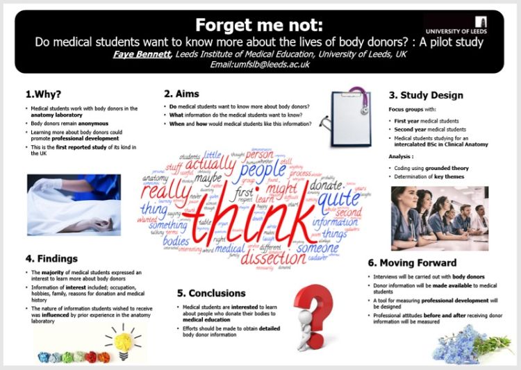
Make an impact with your title
Here is an example that successfully uses the technique of a catchy title. It has the double meaning of forget-me-not, both in relation to medical donors, and also the common flower. This poster has good use of colour and images as well as a clear layout and obvious reading order.
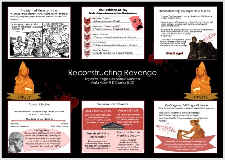
Use striking images to grab your audience’s attention
This poster also has an intriguing title with impact – it grabs your attention and makes you want to read on. The use of images is also very striking, packing in a lot of information.
Use a take home message to be memorable
This poster is an example of one using a portrait orientation. It has good use of colour and a clear structure. The “Take home” message is a nice touch – achieving the idea of communicating one memorable key message.

Final checking
Before you print and present your poster, make sure you check the different elements work together. Produce a full size draft and read it through for sense and proofread it for errors.
Ask someone else to read it. Check if they have any confusion about the reading order and whether they understand your key messages.
Now you are ready to produce the final version!